BRAND IDENTITY
ART HOUSE
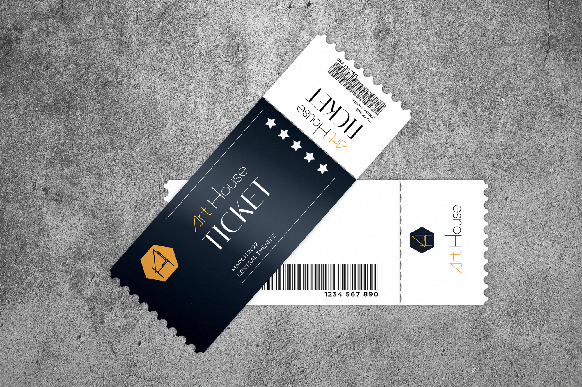
Art House is an independent movie theatre in downtown Toronto that required a full visual identity, including logo design and supporting brand elements. The theatre screens a mix of independent films and select Hollywood releases, with the goal of encouraging audiences to engage more with alternative cinema. The identity needed to reflect both the cultural positioning of the theatre and the experience of visiting a curated, design-conscious space.
Art House is positioned as an alternative cinema experience that balances independent film culture with accessibility. The brand is designed to appeal to a culturally engaged audience who value film as both entertainment and craft, and who seek a more intentional viewing environment.
The visual identity is built around three core brand attributes: alternative, welcoming, and elevated. These qualities informed the development of the logo system, colour palette, and supporting visual elements. The design language is structured to feel both refined and approachable, reflecting the dual nature of the cinema as both a creative and social space.
Toronto Film School - Academic Project
Client:
Brand Identity
Logo Design
Logo Animation
Merchandise
Deliverables:
Brand Identity System
Logo Design


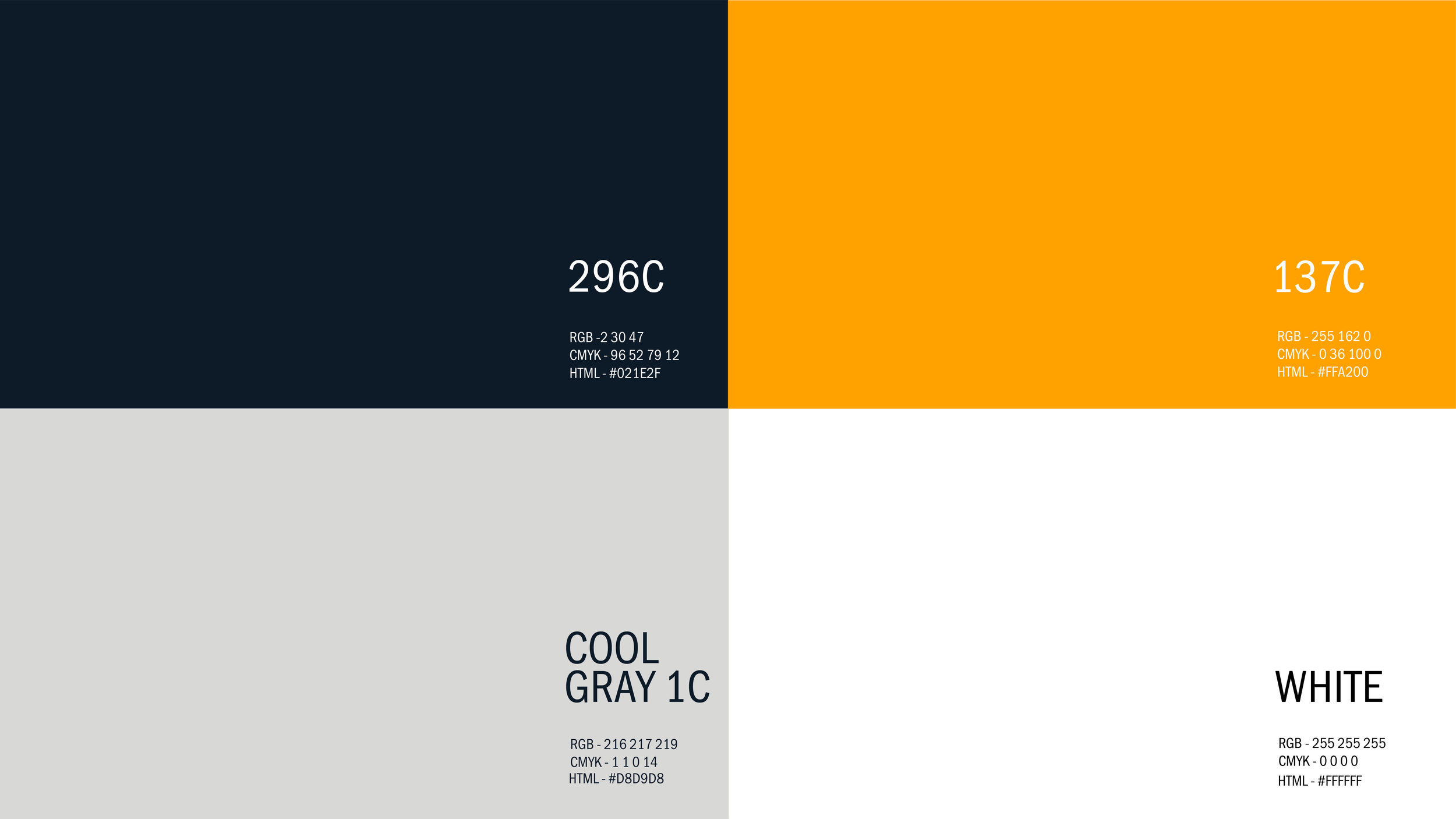
Colour Palette
Brand Pattern

The brand pattern is constructed from a repeating graphic motif, rotated incrementally to form a structured grid of interlocking squares. This geometric system reinforces a sense of stability and comfort, grounding the visual identity. Within the negative space, diamond shapes emerge—subtle symbols of rarity and distinction—reflecting the theatre’s role as an alternative cultural space operating parallel to mainstream narratives. Drawing from Art Deco influences, the pattern introduces a refined, luxurious tone that aligns with the theatre’s sophisticated and artistically driven identity, resonating with a culturally engaged audience.
Logo Animation
Brand Applications
Logo Applications & Merchandise Designs