THE LIGHT PRINCESS
MOVIE POSTER DESIGN
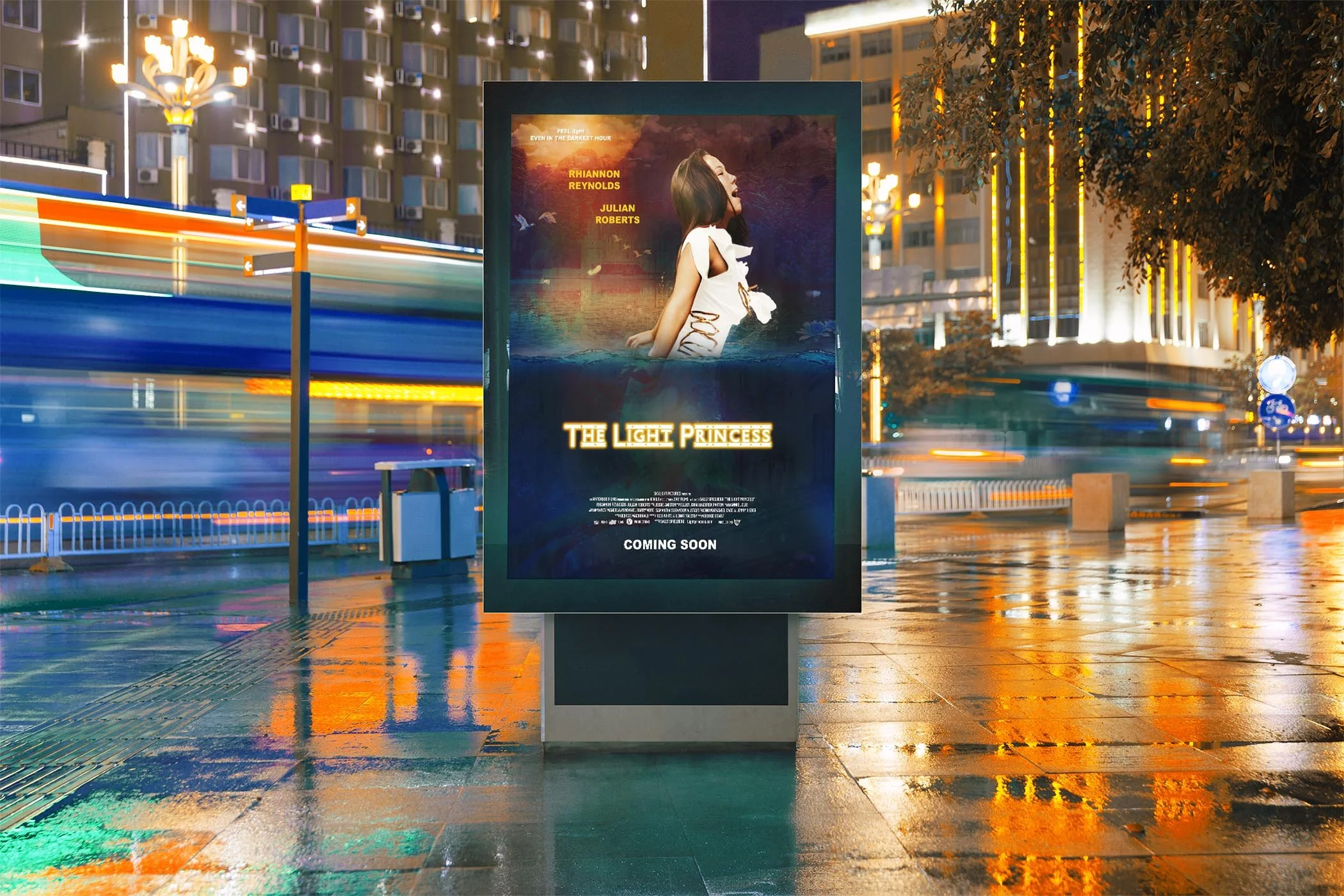
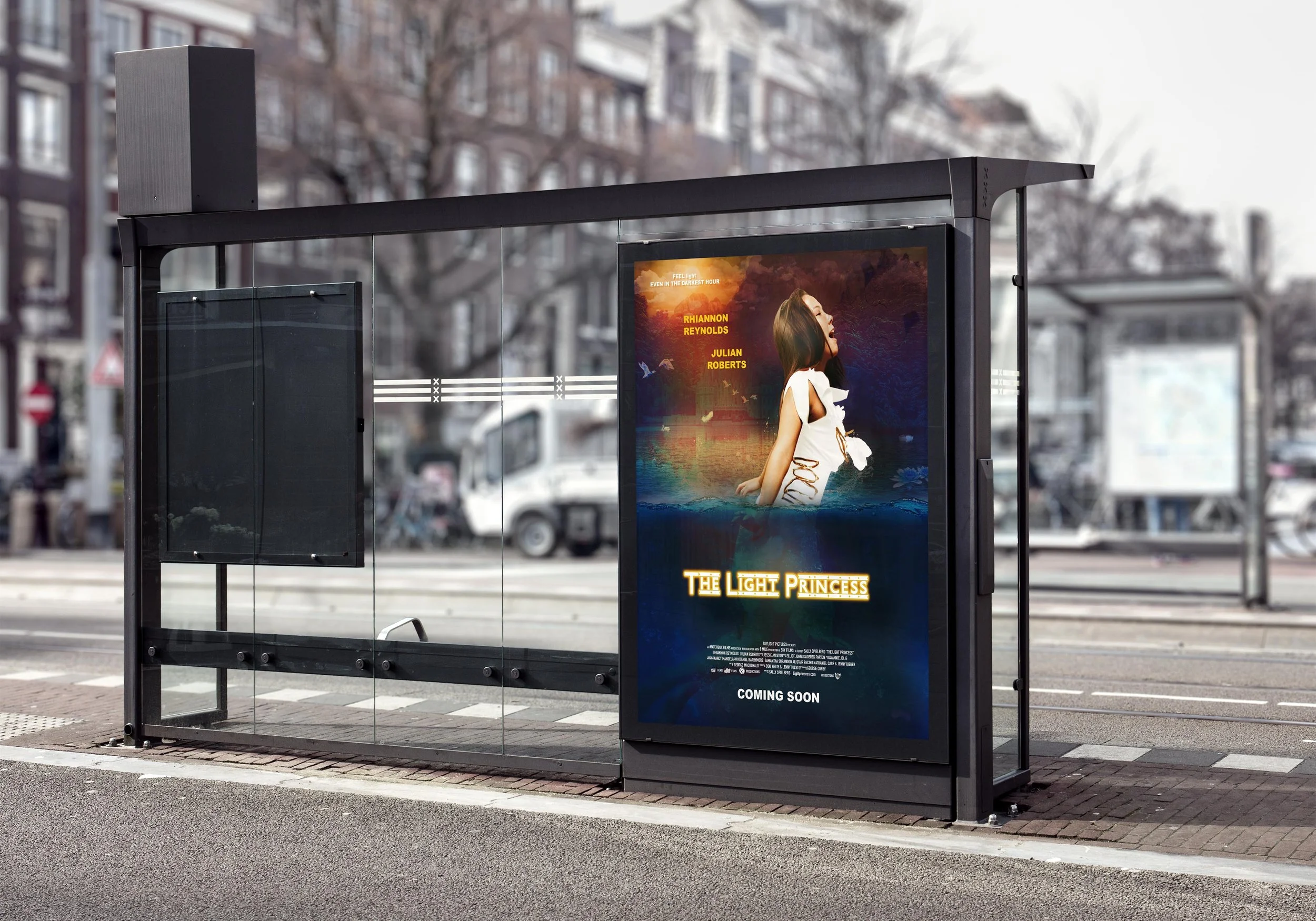
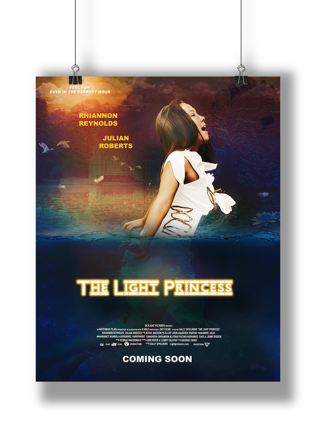
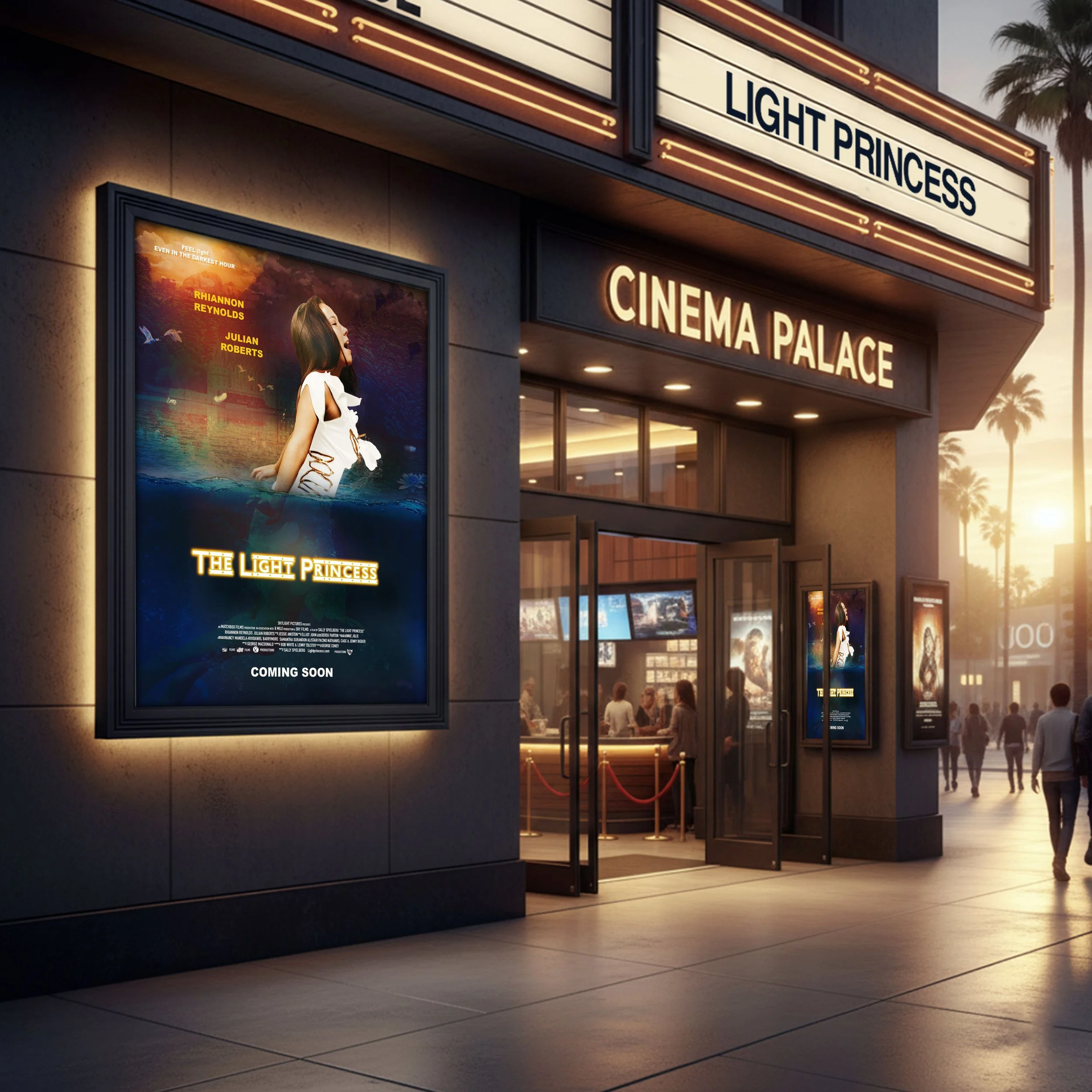
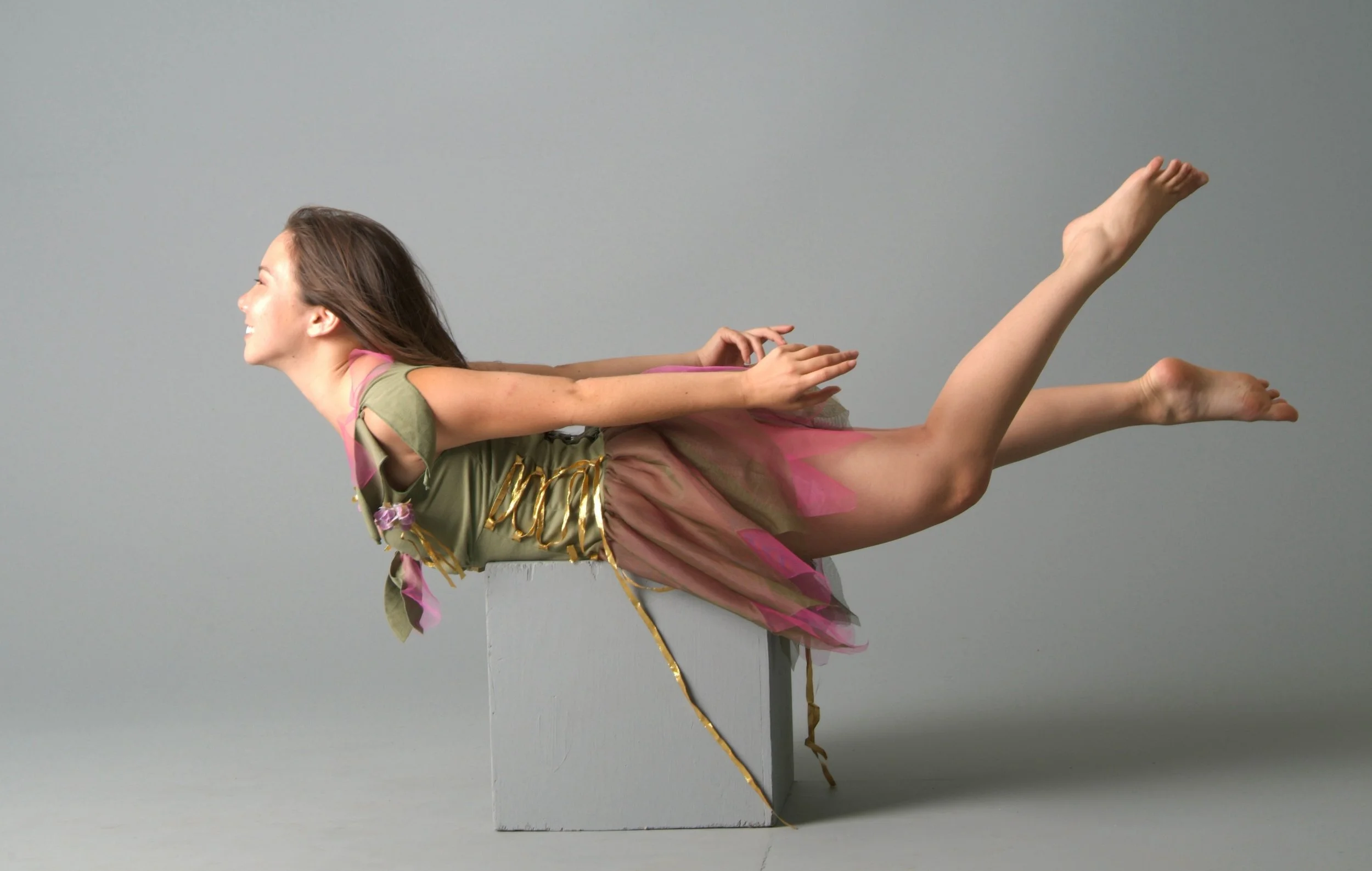
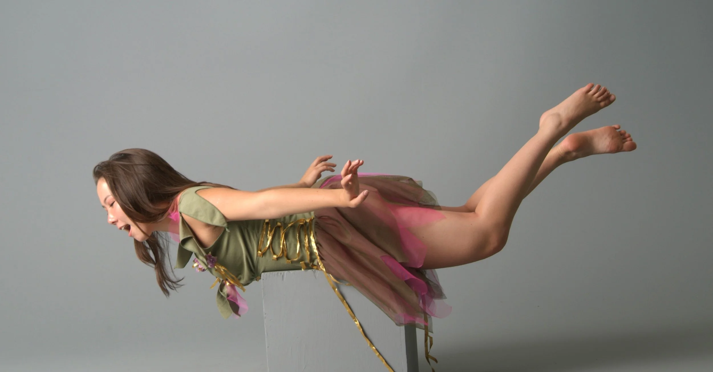
This project is a movie poster design for The Light Princess, based on the 1984 Scottish fairy tale by George MacDonald. The film is multi-genre, incorporating elements of comedy, musical, horror, and action. The poster was designed using provided image assets and copy, with the intention of focusing on a single genre direction while still reflecting the broader tone and narrative of the film.
The design communicates the central theme of the story through a structured visual contrast between opposing forces. The communication goal, “life is a balance between gravity and levity,” informs the overall composition and conceptual approach. The poster is divided by a horizontal waterline that separates two distinct environments. The upper section represents air, lightness, and freedom, while the lower section represents water, weight, and emotional grounding. This division reflects both the physical and psychological contrast present within the narrative. The protagonist is positioned across both spaces to emphasize duality, with body placement and gesture used to communicate movement between opposing states. Supporting elements such as the castle, clouds, kites, and underwater imagery function both as visual contrast between environments and as symbolic references drawn directly from the narrative, reinforcing key motifs present within the original fairytale. Her hands further reinforce this contrast. The hand beneath the water appears weighted and pulled downward, suggesting resistance and tension within the lower environment. In contrast, the hand above the water moves more freely, reinforcing lightness and release. Her body is positioned facing forward to emphasize progression and movement through the composition, while she turns away from the “spotlight,” highlighting a dramatic, emotionally charged moment typical of musical storytelling. This positioning also reinforces the central theme of the fairytale, reflecting the balance between opposing forces that defines The Light Princess.
The final composition uses contrast, symbolism, and spatial division to communicate the core message of the story, creating a poster that functions both as a narrative interpretation and a promotional visual that reflects the emotional tone of the film.
Client:
Toronto Film School (Academic Project)
Concept Development
Typography Design
Colour System
Poster Design
Deliverables:
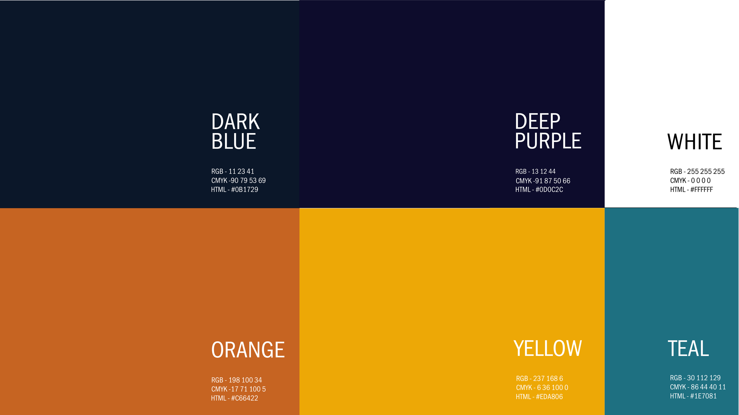
Colour Palette & Typography
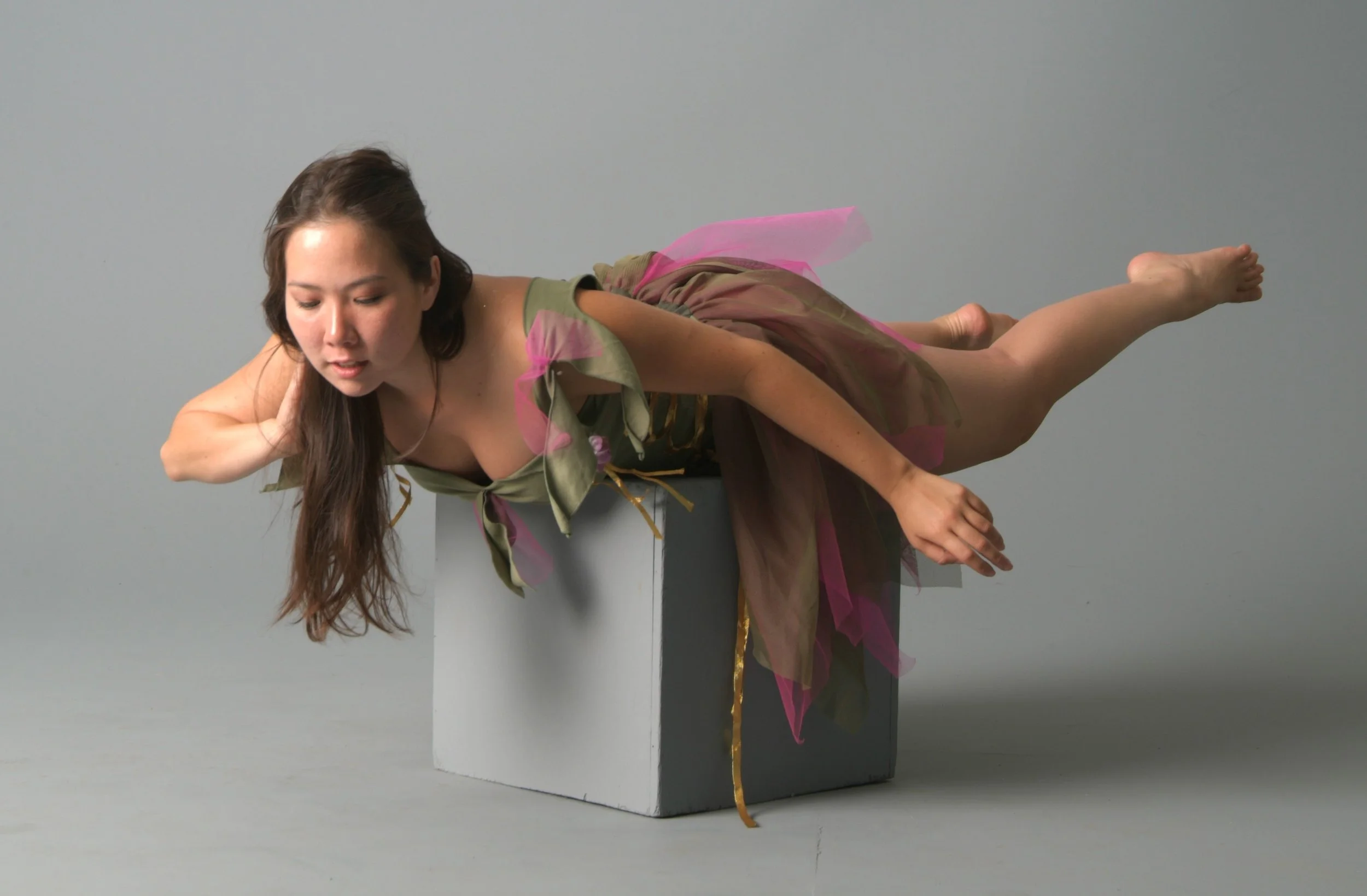
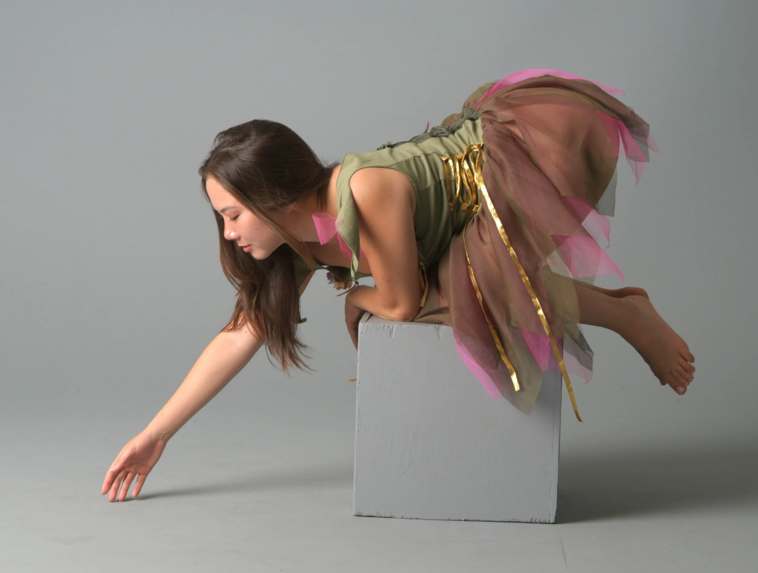
Original Imagery Assets

Movie Poster Design