
MAGIS
BRAND IDENTITY SYSTEM
CASE STUDY
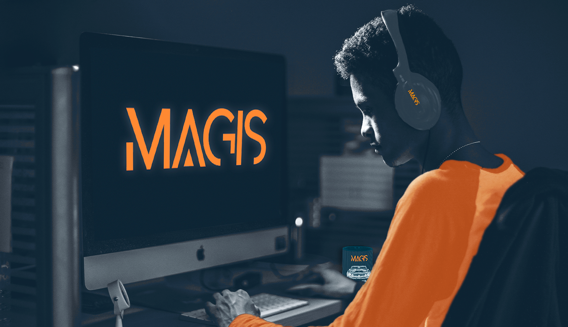
MAGIS is a custom car shop video game that required the development of a full brand identity system, including logo design, brand standards guidelines, and multi-platform applications. These were developed to establish a cohesive storytelling and brand experience across all touchpoints, and extended into merchandise design, digital banner systems, and a limited-edition packaging concept.
The game allows players to salvage, purchase, and modify used classic cars through a process of rebuilding and customisation. MAGIS is strongly car-centric, focusing on construction, detail, and personalisation. The visual identity combines modern precision with retro automotive influence, creating a balance between technical control and expressive design.
The brand is defined by the keywords focused, friendly, joyfully expressive, and detail-oriented, which informed all visual and conceptual decisions throughout the project.
Toronto Film School (Academic Project)
Client:
Brand Identity
Logo Design
Brand Standard Guide
Digital E-Streaming Banners
Merchandise
Art Direction for Collector’s Edition Packaging
Deliverables:
Brand Discovery Phase
Research
Research was conducted across multiple platforms to better understand the target audience for the game. This included interviews with car enthusiasts and gamers, analysis of automotive brands, and review of related articles and user insights. Findings showed that the core audience sits between 15–55, with the majority between 20–35. This reflects a mix of older automotive traditions and younger digital engagement. The research highlighted a shared passion for cars that spans both hands-on mechanical interest and gaming culture. The audience was also identified as primarily male, with a strong interest in both car modification culture and simulation-based gaming experiences.
Market Segment
The market segment was divided into two key groups. The first group consists of automotive enthusiasts who are passionate about building, modifying, and working on cars. These users see cars as more than transport and often use driving and construction as a form of escapism and personal expression. The second group consists of gaming-focused users who may not engage with cars in real life but develop an interest through simulation games. For this group, MAGIS acts as a gateway into automotive culture and allows them to explore car building and customisation in a virtual environment. Both groups are connected through a shared interest in cars, but engage with them in different ways.


Design Development Phase
Design Elements
When considering a brand’s visual identity and the elements involved in establishing a cohesive and consistent voice, the design process focused on ensuring that all visual components supported a unified communication goal across platforms. This included lines, shapes, colour, typography, imagery, and layout. The process began by considering the symbolic meaning behind each design element, ensuring the brand’s keywords, message, and personality were consistently reinforced in every decision.
Logo Design
The logo design process involved developing multiple directions, including wordmarks, lettermarks, combination marks, and symbols. A key consideration throughout was readability, ensuring the logo would remain clear across all platforms and scales.
Below are some of the variants developed in this process:

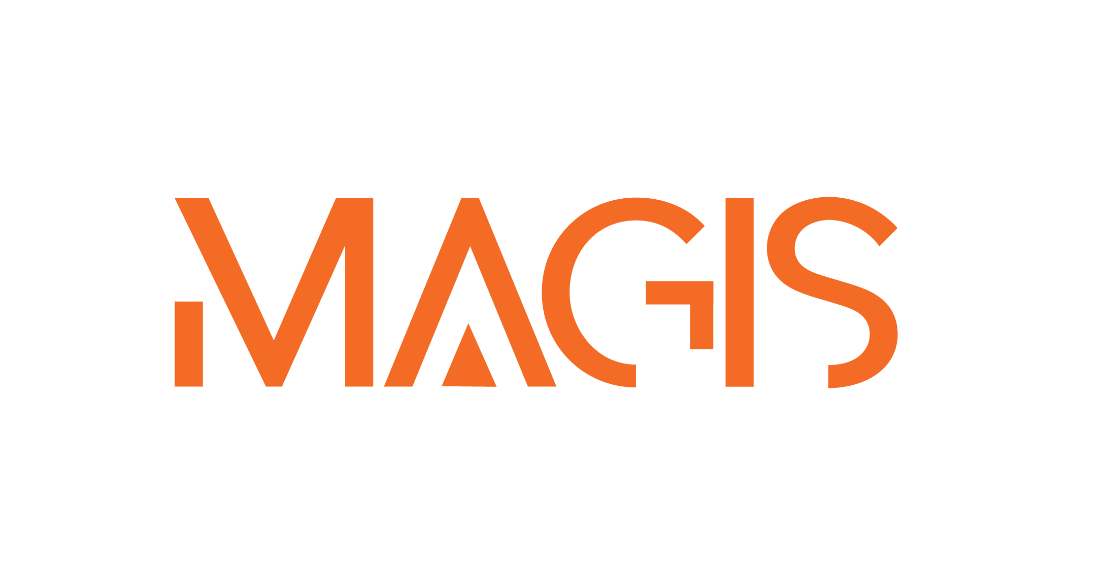
The final solution used a sans serif wordmark based on the font Abster. The design features modified letterforms, including a triangular addition to the “A” and a lowered crossbar on the “G,” introducing subtle structural changes. These alterations reflect the brand’s focus on building, modifying, and customising cars. The wordmark communicates both the brand identity and its association with construction and precision, while also referencing roadways and directional movement through its geometric form.
The Final Logo
Primary Logo

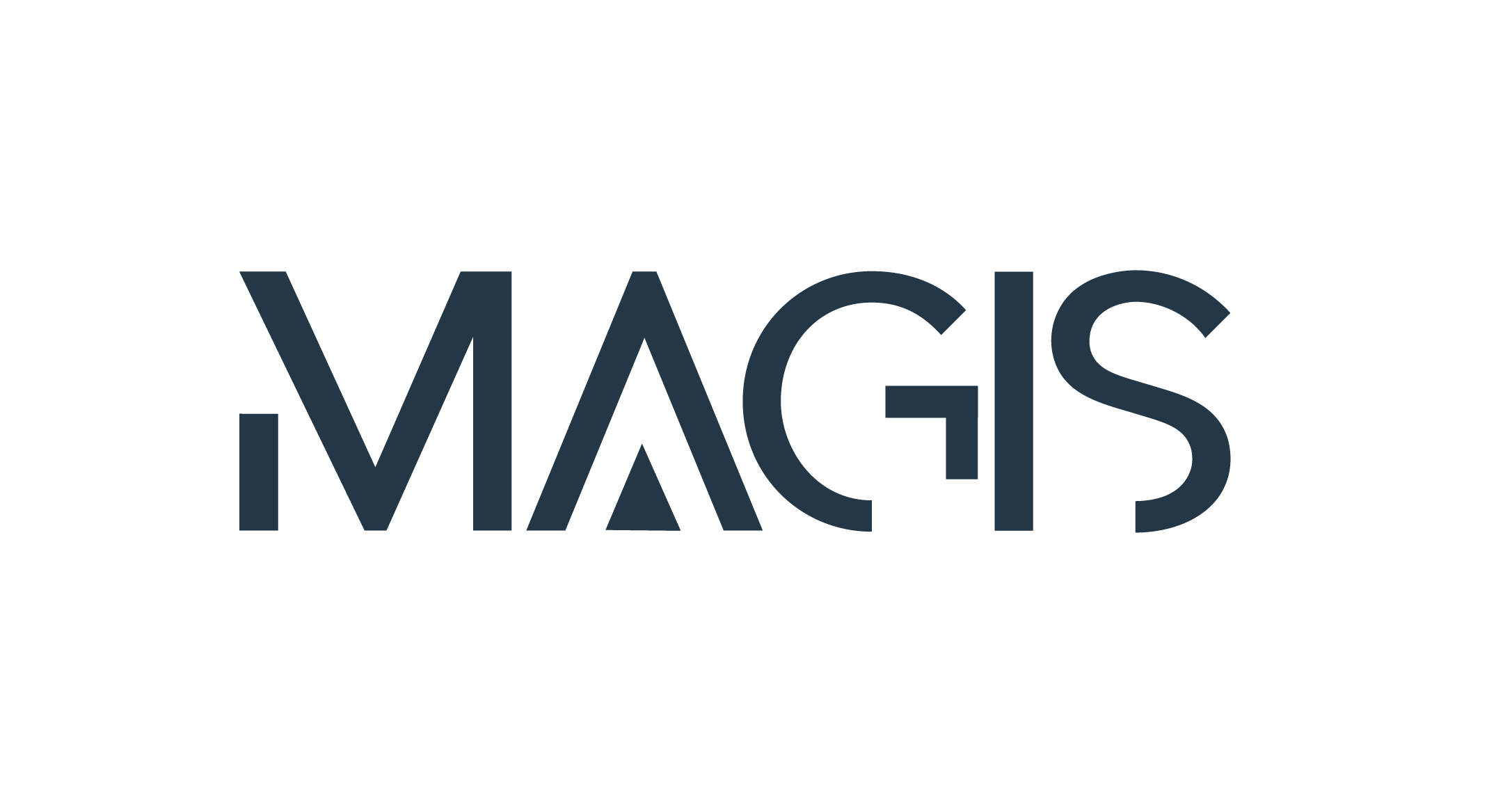
Other Logo Variants

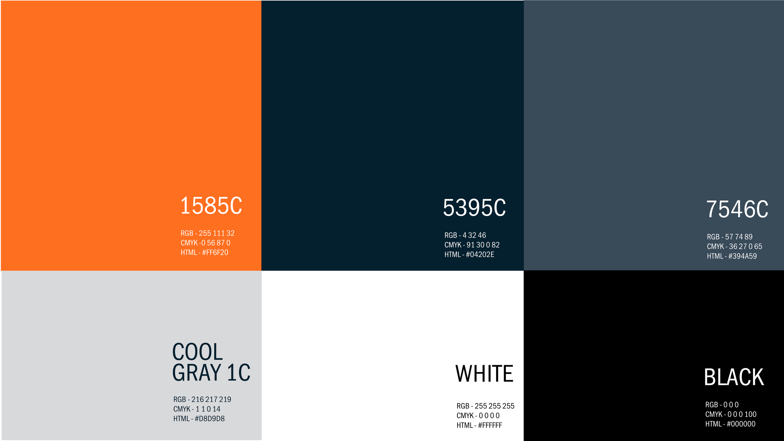
Colour Palette
The colour palette was developed to strengthen brand recognition and support the overall identity system. The primary colours include orange and two tones of dark blue. Orange reflects retro automotive culture while also communicating energy, approachability, and construction. It reinforces both the creative and mechanical aspects of the brand. Blue represents confidence, knowledge, and precision. The darker tones add a sense of control and professionalism, reinforcing the brand’s technical focus. Secondary colours include grey, black, and white. Grey reflects mechanical structure and industry, white represents innovation and clarity, and black reinforces authority and refinement.
Typography
The typography system uses the Poppins font family to support the geometric structure of the logo. Poppins reflects similar straight lines and rounded forms, creating consistency across the brand identity. It is used across both headers and body copy, with variation in weight and size to create hierarchy. Bold weights are used in headers to reinforce the energetic and expressive tone of the brand, while regular weights maintain clarity and readability.

Imagery
The visual language combines photography and graphic elements to reflect the brand’s focus on construction, modification, and design. The imagery is intentionally car-centric, focusing on components such as engines, wheels, steering systems, and interiors rather than full vehicles. This approach reinforces the idea of process over final product, highlighting transformation and construction. Full vehicles are used selectively when presented as fragmented, stylised, or blueprint-based visuals to maintain this focus. Human figures are included only when they support the narrative without shifting attention away from the automotive focus.


Brand Standards Guide
Brand guidelines were developed to ensure consistency across all applications of the MAGIS identity. This document establishes rules for the correct usage of visual elements, maintaining cohesion across all brand touchpoints.


Design Deliverables
1) For users engaged in automotive construction and modification, functional tools such as wrenches and car equipment were developed. These users already work on their own cars, and MAGIS allows them to extend this practice within a simulated environment. The merchandise reinforces this connection by bridging the game experience with real-world workshop activity.
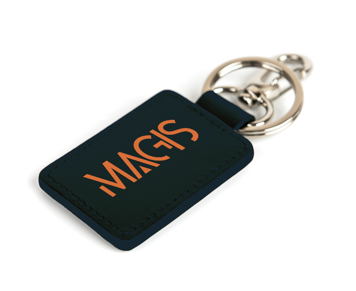
2) For driving-focused enthusiasts, a branded car keychain was designed as a functional everyday object. This group values driving for its experience and escapism, and the keychain acts as a subtle connection to that identity.
3) For gaming-focused users, merchandise such as clothing, accessories, and mugs was developed. This allows the brand to extend into their daily environment and become part of their everyday interaction with the game.
Merchandise Design
The merchandise designed for MAGIS considered not only the visual consistency of brand identity, but also the market research that defined the MAGIS’ target audience and their individual interests and needs. There were three different types of car enthusiasts who were passionate about cars in different ways and the merchandise needed to connect their target audience to the game meaningfully.


Digital E-Streaming Banner Design
The banner system for MAGIS was designed for use across both vertical and horizontal formats in digital environments. Vertical banners emphasise structure and precision through their upright composition, reinforcing the controlled and technical aspects of the identity. Horizontal banners provide flexibility and visibility across web platforms, including e-stores and gaming environments, where they function as header-based brand elements. Both formats ensure consistency while allowing adaptability across platforms.


Horizontal Banner
Vertical Banner
Art Direction for Limited Edition Packaging
Art direction was developed for a limited-edition packaging system extending the MAGIS identity into a physical format. The direction applies the established colour palette, typography, and layout system to maintain consistency with the broader brand identity. The packaging prioritises clarity and simplicity while maintaining strong visual presence. The concept also defines structural and production considerations including layout hierarchy, material direction, and functional application, forming a complete framework for execution.

