BRAND IDENTITY
GREEN SPACE
Green Space is a landscape architectural firm specializing in landscape architecture, arboriculture, urban ecology, LEED, and green roof design. Green Space strives to augment the urban experience by connecting people to nature and enhancing site ecologies.
This project involved the development of a visual identity system including logo design and animation, colour palette, and typography. The identity was applied across two key executions: a folder design and a billboard hoarding system.
The design represents the brand’s expertise in landscape architecture while reinforcing its corporate and professional services. It highlights the firm’s architectural focus, professional voice, and naturally creative approach, reflecting its position within the built environment and ecological design sector.
The final identity system communicates a consistent voice rooted in ecological design, creating a cohesive system that functions across both architectural and public-facing applications.
Brand Identity
Logo Design
Logo Animation
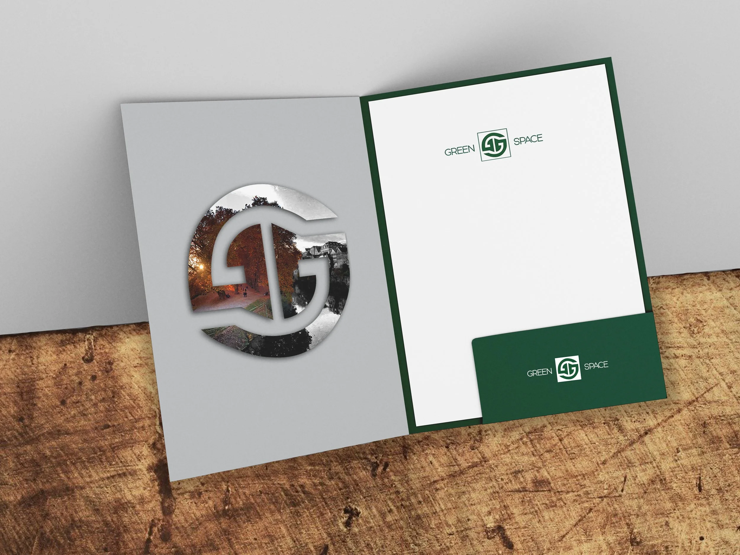
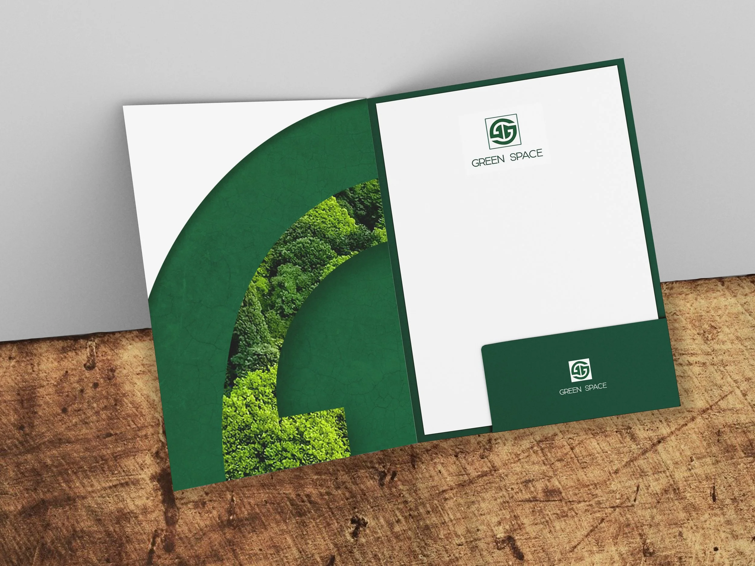
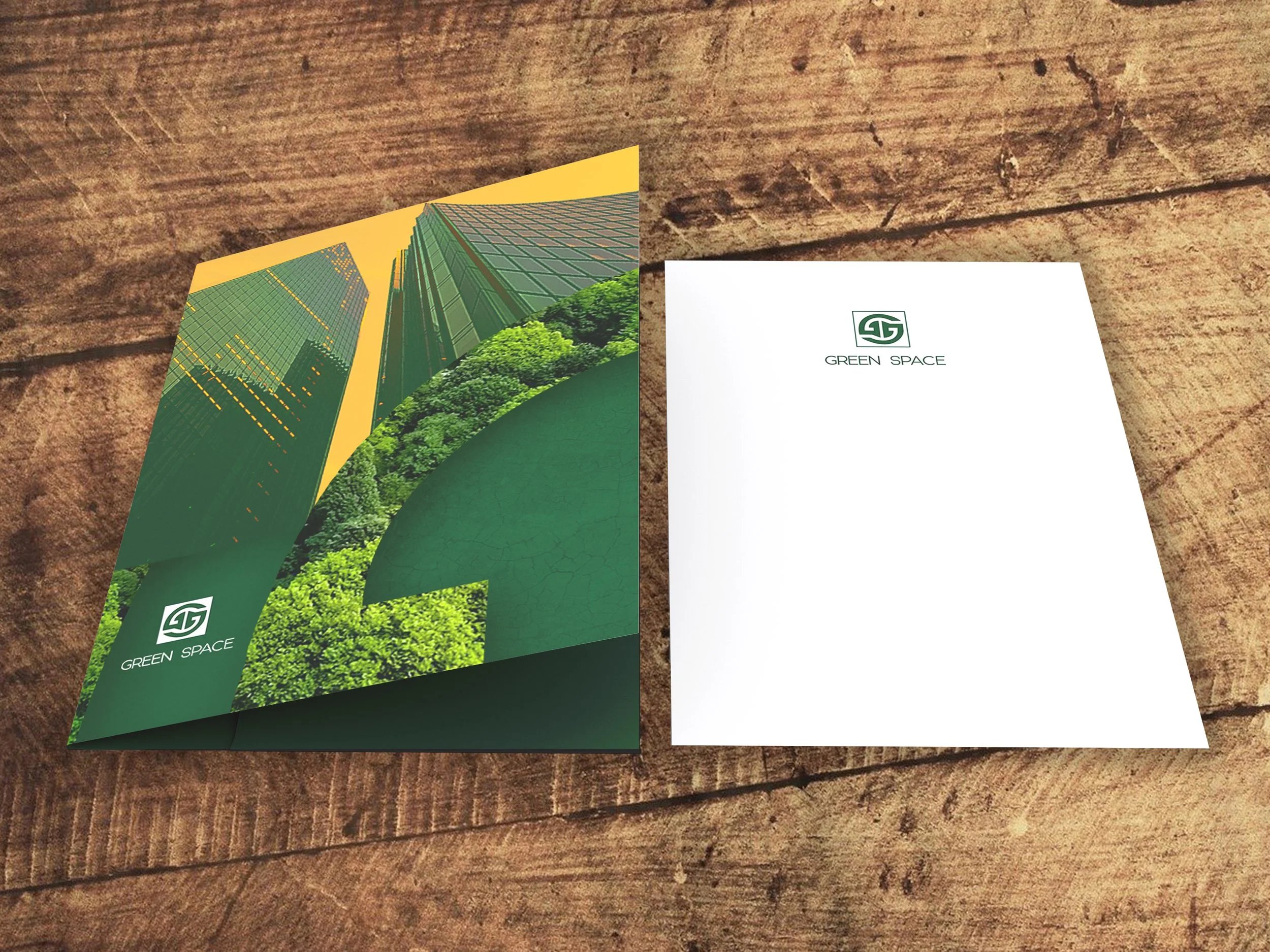
Folder
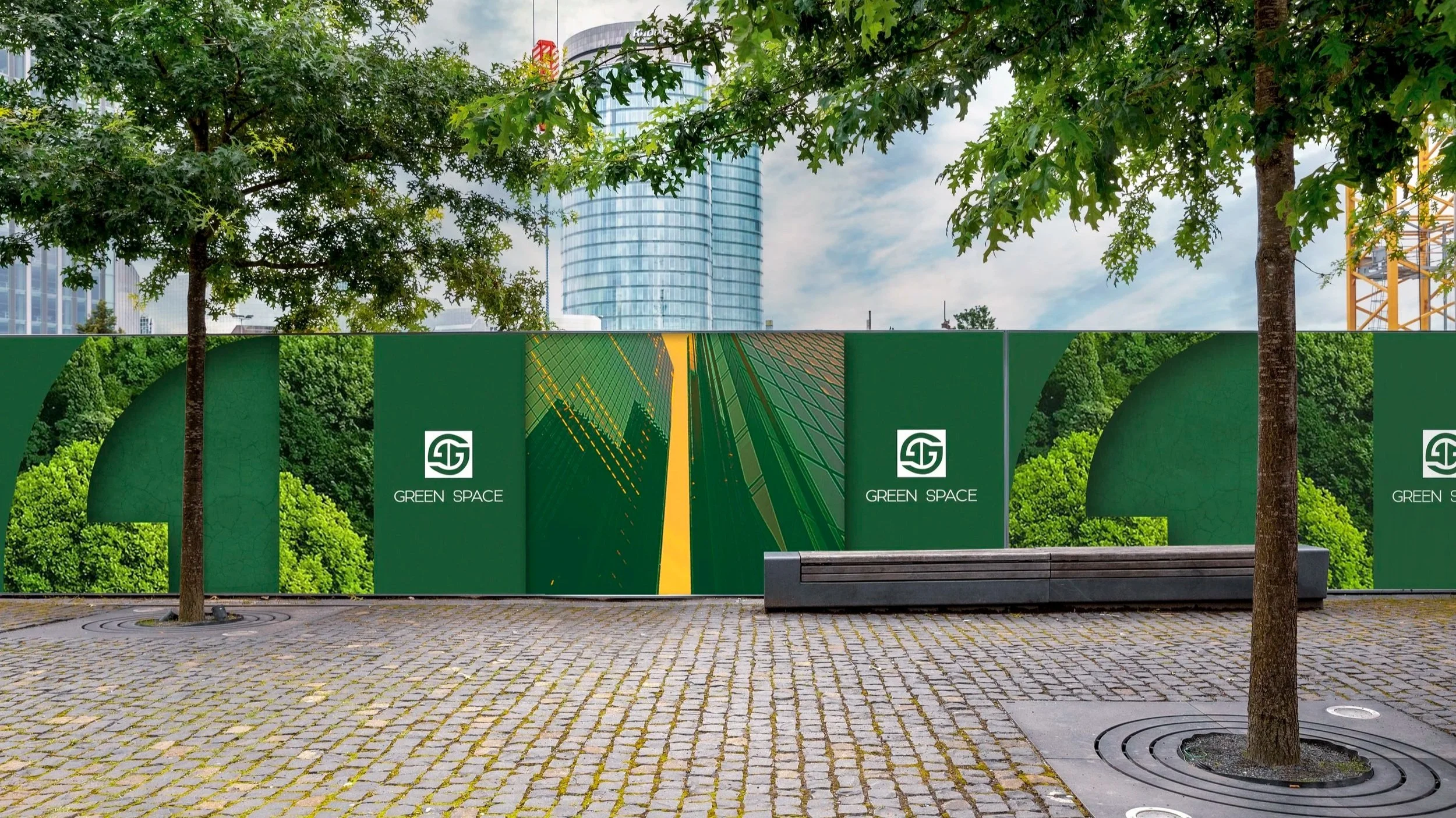
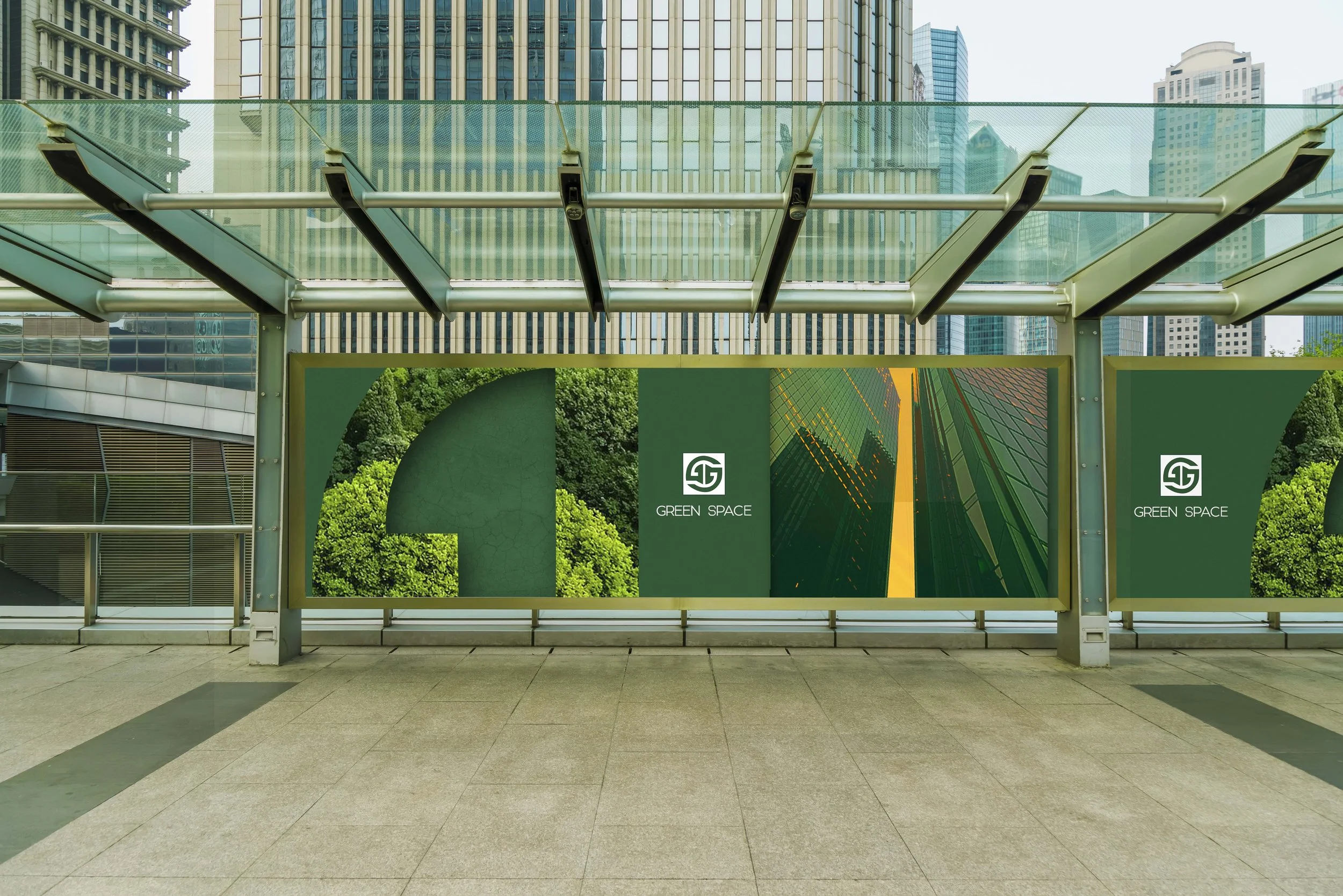
Billboard
Toronto Film School (Academic Project)
Client:
Deliverables:
Brand Identity System
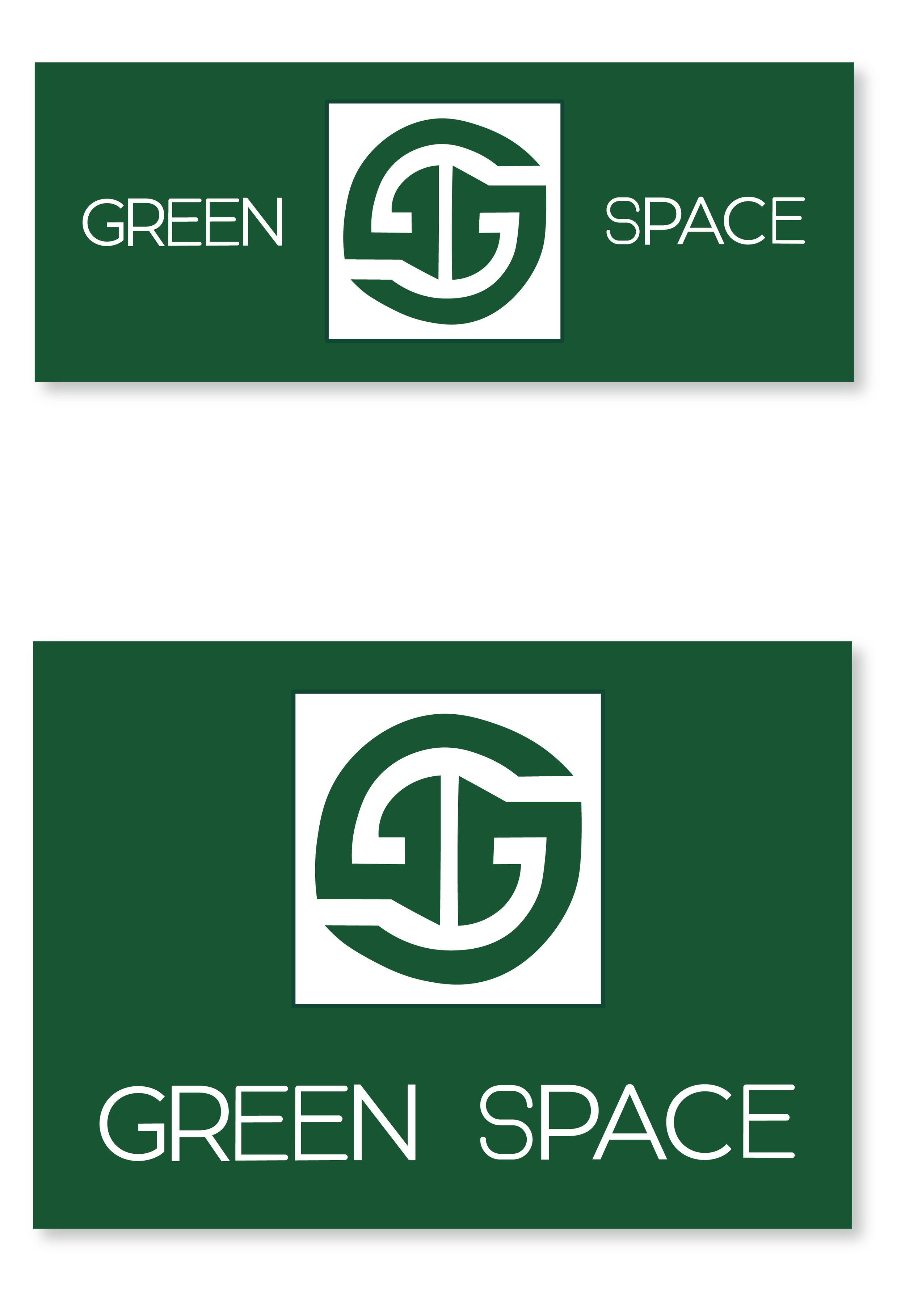
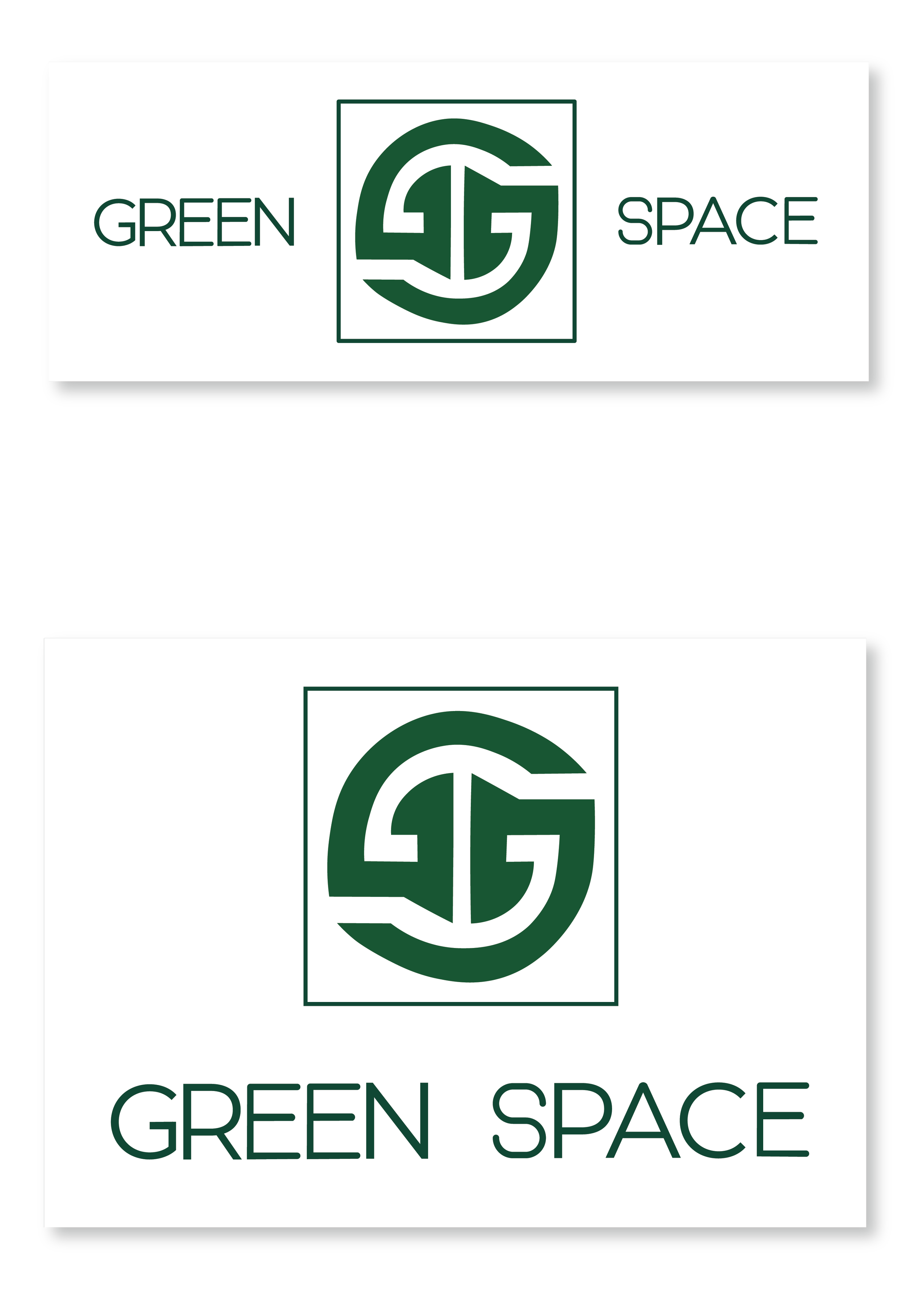
Logo
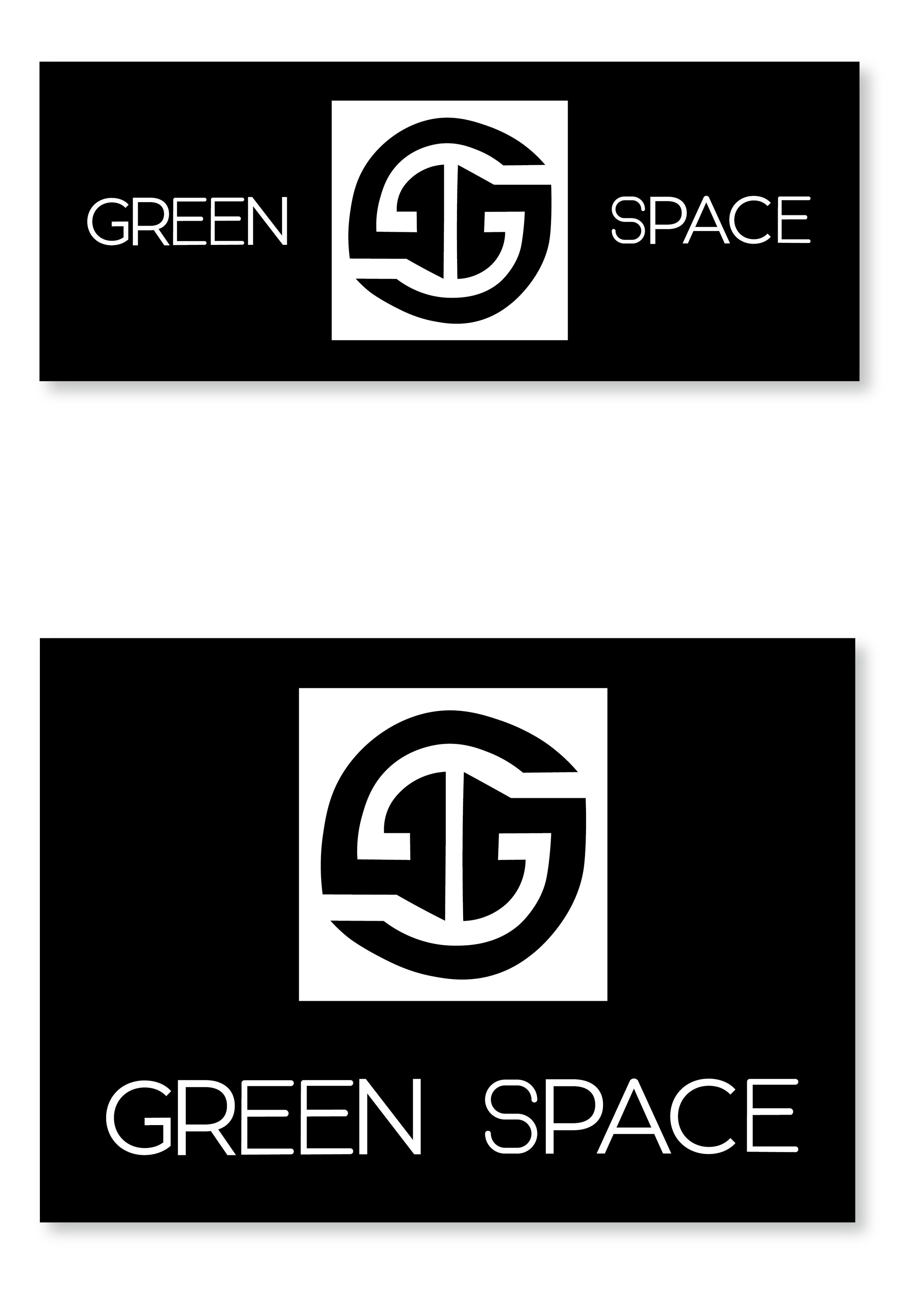
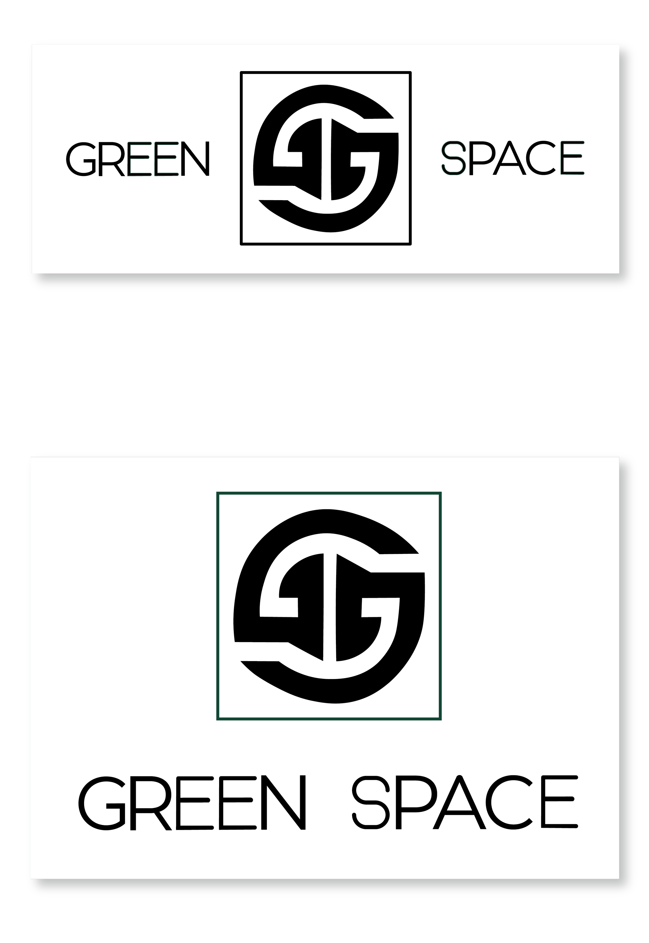
Black & White - Vertical Logo
Black & White - Horizontal Logo
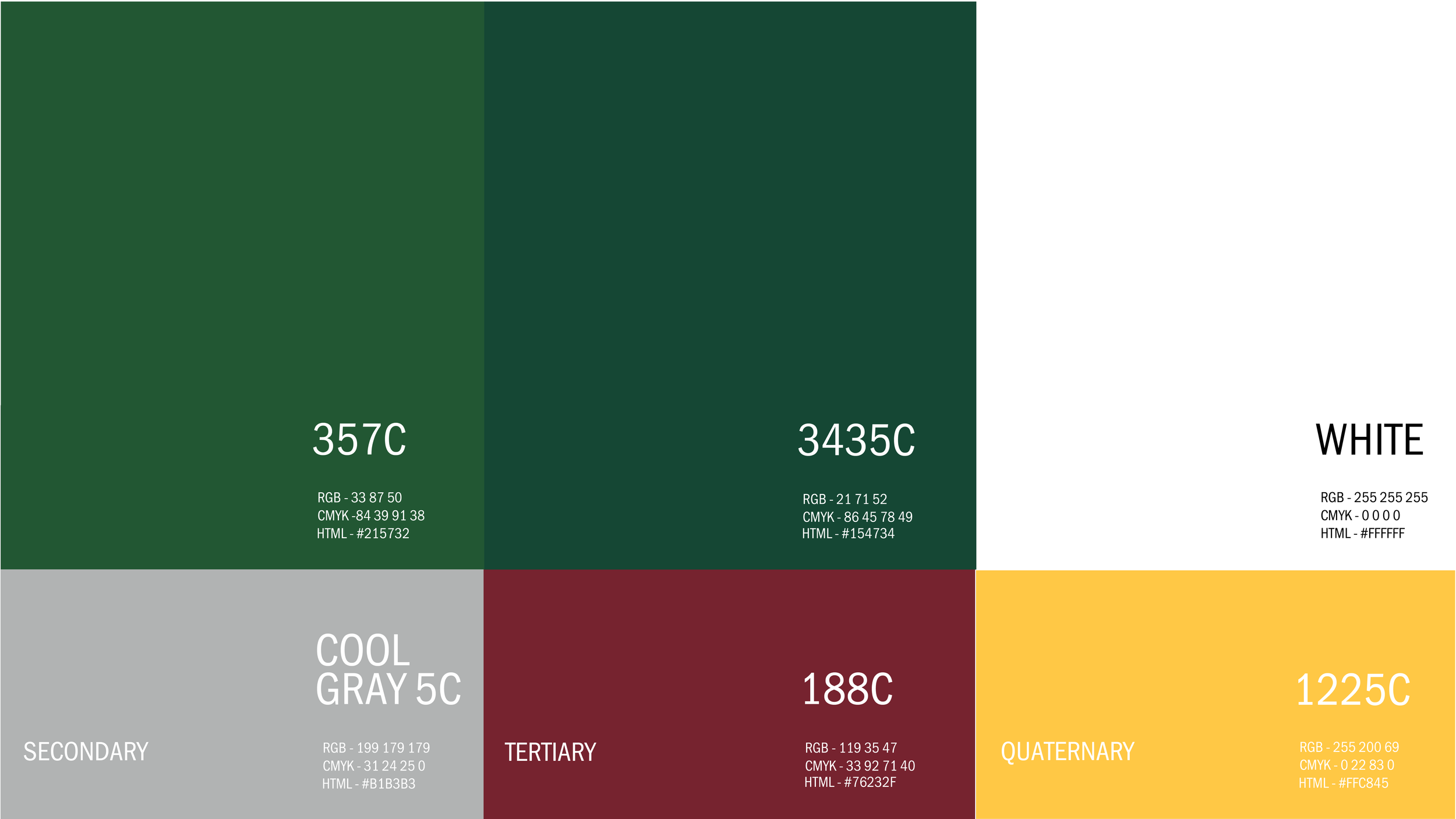
Colour Palette & Typography
Logo Animation
Brand Application Explorations
Executive Approach 01
This design approach highlights Green Space’s professionalism through a clean, minimal aesthetic that emphasizes the brand’s primary green—Pantone 357C. The layout also incorporates the quaternary yellow, Pantone 1225C, creating a subtle but effective color contrast. Inspired by the core geometric forms found in the logo, this concept features enlarged elements of the logo shape to establish visual interest and brand recognition. The use of shape and imagery reinforces the brand’s mission of enriching urban environments and ecological spaces, tying visual identity to core values.
Executive Approach 02
This approach maintains the clean and minimal aesthetic, utilizing Green Space’s dark green colour, Pantone 3435C, while placing emphasis on the brand’s secondary color, Pantone Cool Gray 5C and white. Other brand colors are subtly integrated through the supporting imagery. Full-color elements are reserved for depictions of people and nature, emphasizing Green Space’s connection to community and the natural world within urban settings. The rest of the imagery remains in grayscale to create contrast and focus. This approach reflects the brand's passionate professional voice and naturally creative personality, while visually supporting Green Space's mission to enrich the urban experience by connecting people to nature and enhancing site ecologies.